These are the images from my magazines cover, table of contents, and double page spread.
Cover Page
These are the images from my magazines cover, table of contents, and double page spread.
Cover Page
This is the development for my front cover designs. This section will include my ideas and improvements during the process of making my magazine's front cover.


These are a few examples of women's fashion magazine that I found online. They are from famous companies such as Vogue and Porter.
In this post, I will demonstrate some basic design skills that I learned in class.
I started by sketching 6 designs on paper traditionally. I am not very good at drawing but I tried my best with recreating what I want in my magazine covers. I think that they turned out to be quite good, I like that they are neat.
My teacher, Mr. Nick, also made some default layouts for our class so that we could visualize our final magazines better and have an easier time planning the layout of our magazine.
Reflection:
This is my weekly progress for semester 2, starting from week 1 of semester 2.
Week 1: This week we continued on our magazine project. So far we've collected photos of the locations we might use for our shoots. On our last lesson, I started my risk assessment of my photoshoot locations. I plan on finishing it at home as we don't have much time in class, seeing as we spend 1/2 of the time with studying media and not the project. I am satisfied with the information I've gathered, however I feel a bit worried as they're all in another country and I would need to travel back there again, and have to juggle my schedule.
Week 2: This week we continued our magazine project, this time we are planning our magazine covers. We also learned more about media ownership and consolidation, doing a lot of group work in class. We researched about different case studies, such as Disney buying 20th Century Fox. We then compared our work with other people and made comments about each other's work (what we could improve, elaborating further, etc). In our magazine project, we made traditional sketches of how we want our magazine layout to look like. Our teacher also gave us a premade layout made by him so we could plan our magazine covers easier. I feel this week was personally very fun and I think I could do well on my project. For my photos, I am planning to shoot all of them (both cover and content pictures) over the weekend (19 - 21 January 2024). I hope that I will be able to finalize all my photos by the end of this week, or next week if I run out of time.
Week 3: The formatting of my blog has been changed so that the audience could look through it easier. This week we continued our magazine project. We started sketching our plans for the front page magazine cover. In our normal theory class, we have started learning about how news is spread and selected. I personally found it interesting as it included many details about the media that I, as a consumer, normally wouldn't notice. I plan on doing a self-study at home so that I could prepare for my upcoming test. I also plan on doing personal research so that I could come up with more case studies to write about in my exams. I have a lot to catch up on in my magazine project so I will try to do that as well.
Week 4: I was absent a lot this week because I was sick, but I met with my teacher after class to see what I have missed out on in lessons. My classmates have started on their self-critical reflection so I did that too. I used Canva to create the presentation, but I am having a hard time finding a suitable template that could match with my topic. I could make my own presentation but I think that it would take too much time and I would like to focus more on my magazine project rather than the aesthetic of my self-critical reflection presentation. I have a lot more research to do for my magazine project so I will do it in my free time. Most of our time in class now is being dedicated to doing our project.
Week 5: This week was our unit test. I felt incredibly nervous as I usually barely pass in media studies, so I studied a lot a few days and the night before. For the unit test, I decided to choose 3 case studies that I could write about, Heineken x James Bond, Mcdonald's x Sanrio, and Mobile Legends x Attack on Titan. They are case studies that I personally found interesting and that I could have fun with writing about. There are also theories I spent time memorizing, such as the Reception theory by Stuart Hall. I have a hard time memorizing things so I did my best and hoped that I could pass this time. This week, my classmates and I started on our front cover research and development. I didn't gather much photos because it was an error on my part and I only gathered a little. However, I am proud that they look good. I chose my final picture for my front cover and started editing it by adding the proper lighting, saturation, article headlines. etc. I think that I have a very good eye for design and my friends have said that the front cover that I've created is good enough on its own, so I don't know how to design other front covers that could rival my first one. I think that I will end up going with my first trial, but I will try my best to create other designs. I will also try to stop procrastinating and create a time slot wherein I could attempt to continue my magazine project at home.
Week 6: It is nearly the deadline and I am feeling anxious because I have procrastinated a lot of my project. I want to rush and finish it all before Thursday's media studies lesson. I have many things to do, and I want to also add more research and development details to my blog's posts. I plan on at least finishing half of my project during Tuesday's media studies lesson and do the rest at home. Our teacher has allotted one day for each post (double page spread research and development, front cover research and development, contents page research and development). I believe that I can finish before the deadline and I will stay up doing it if I have to.
do this for doWeek #1, Lesson 3, Term 3, Semester 2
In this post I will perform a risk assessment for the possible risks in my shooting locations.
Location #1: Café Margaret, Haji Lane, Singapore.


Location: The dining area of Café Margaret, a local bakery located in Haji Lane, Singapore.
Purpose of the shoot: The purpose of the shoot is to take a picture for a magazine cover. Parts of the magazine will have sections about travel directed to Indonesian citizens, promoting and advertising a new country to visit for the new year. It would be perfect as the place is in another country and has an amazing, homey atmosphere that is comforting - something that is hard to find in a new country.
Media language: An eye-level shot will be used, as my aim is to create a somewhat personal question between my model and my audience. Warm, slightly natural lighting to create a cozy and realistic environment. Some of Café Margaret's most popular and well-received trendy baked goods will be displayed either alongside the model or in the background. Other props can include travel-related accessories, such as passports and a boarding pass. These will add visual interest and add subtle cues to the magazine's sub-theme for promoting a travel destination. Customers will be included in the background as to communicate the Café's natural environment. They will be gently blurred to draw more focus towards the model. Most of my props and the clothes my model will be colored in earthy tones such as brown, beige, and yellow. Casual yet stylish clothing will contribute to the feeling of comfort and approachability.
Pros: It is easily relatable to the viewer as cafés are extremely common in every country in the world. There are large windows so it would be easy to achieve natural lighting. This café also provides props such as lamps with warm lighting and vintage accessories (photo frames, vases, etc.). This would lessen the need to style the background or spend any money on props. The photos would be highly realistic as actual customers dining would be used in the background. It would feel natural to them as the café is not a set, and in return they will act normally.
Cons: It is a café that recently gained mass media traction and is very crowded during both weekdays and weekends, which means that tourists and locals will be crowding the photoshoot place. This café is also closed on Thursdays, which means that there is a limited time to take photos (only 6 days available out of the usual 7). There is also no guarantee that any spots will be available to use for a photoshoot.
Solution: As my magazine is a fashion magazine with a hint of lifestyle, having people in the background of the cover would suit it well. The article I have written for the also resonates with the café, as the theme for it is travel and fashion. This location is perfect as it is trending on social media platforms and is also in another country.
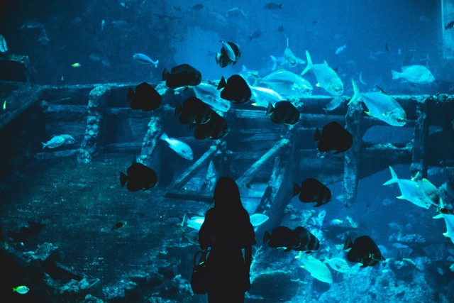
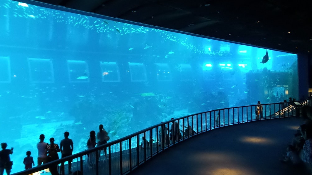
Location #2: SEA Aquarium, Singapore.


Location: The main aquarium in SEA, an aquarium located in Sentosa Island, Singapore.
Purpose of the shoot: The purpose of the shoot is to capture a picture for a magazine cover. The magazine will focus on fashion and travel, directed at Indonesian citizens, promoting and advertising a new country to visit for the new year. SEA Life Singapore is an ideal location as it is in a neighboring country and offers a unique, captivating underwater experience that is both exciting and serene - something that is rare to find in a new travel destination.
Media language: An eye-level shot will be used to create a personal connection between the model and the audience. The lighting will be soft and natural, highlighting the vibrant colors of the marine life and creating a serene, dreamlike atmosphere. Various SEA Life exhibits, such as colorful fish, corals, and the iconic tunnel with sharks and rays swimming overhead, will be included either alongside the model or in the background. Other props can include travel-related accessories, such as passports and a boarding pass, to subtly hint at the travel theme of the magazine. Visitors will be included in the background, slightly blurred to maintain focus on the model while conveying the natural environment of the aquarium. The model will wear clothing in either shades of blue, green, and white to complement the underwater theme, creating a cohesive and visually appealing image. The attire will be casual yet stylish to enhance the feeling of relaxation and approachability.
Pros: SEA Life Singapore provides a unique and visually stunning backdrop with its diverse marine exhibits. The aquarium has large viewing panels and well-lit displays, making it easier to achieve natural and captivating lighting. The location is inherently interesting and does not require extensive styling or additional props.The presence of actual visitors in the background adds realism to the photos.
Cons: SEA Life Singapore is a popular attraction and can be crowded, which may make it challenging to find a suitable spot for the photoshoot without interruptions.The aquarium has specific operating hours, which may limit the available time for the shoot. There might be restrictions on using professional photography equipment within the premises. The reflective nature of the aquarium glass can pose challenges in terms of glare and reflections in the photos.
Solution: To manage the crowd, the photoshoot can be scheduled during off-peak hours or arranged with the aquarium management for a dedicated time slot. A portable lighting setup can be used to counteract any potential glare or reflections from the glass. Engaging with the aquarium staff ahead of time to understand and adhere to their photography guidelinrs will help avoid any disruptions. The presence of visitors in the background will be used to the shoot's advantage, enhancing the theme of travel and making the scene feel more authentic and lively.
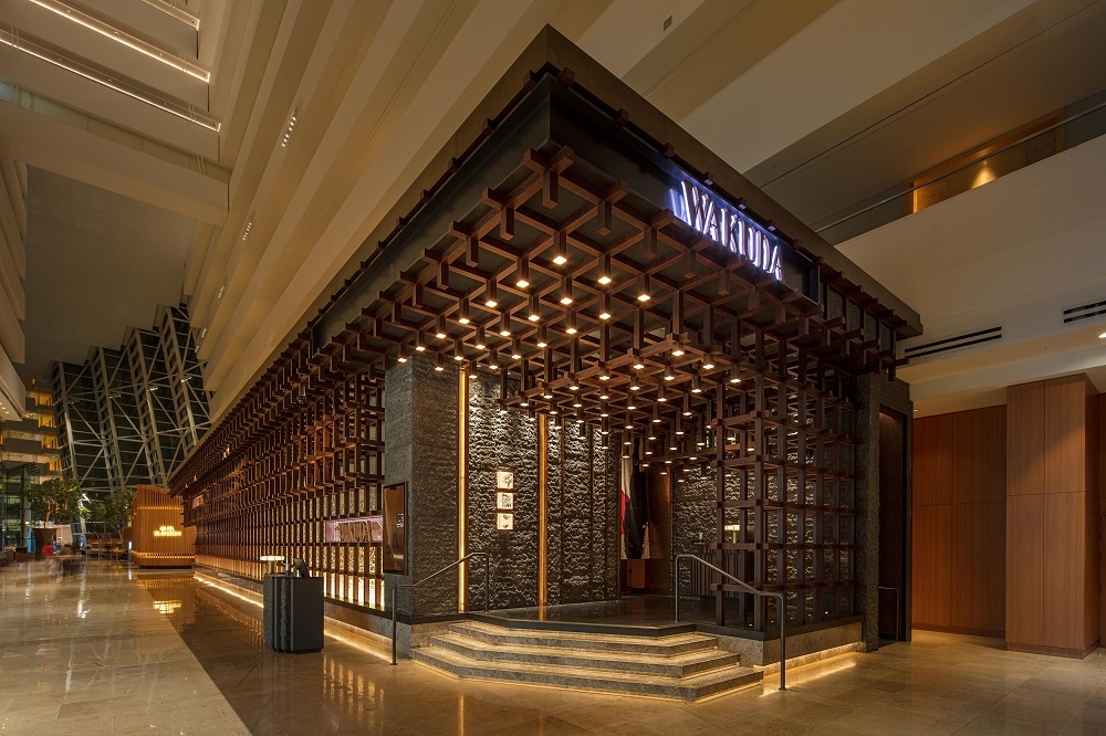
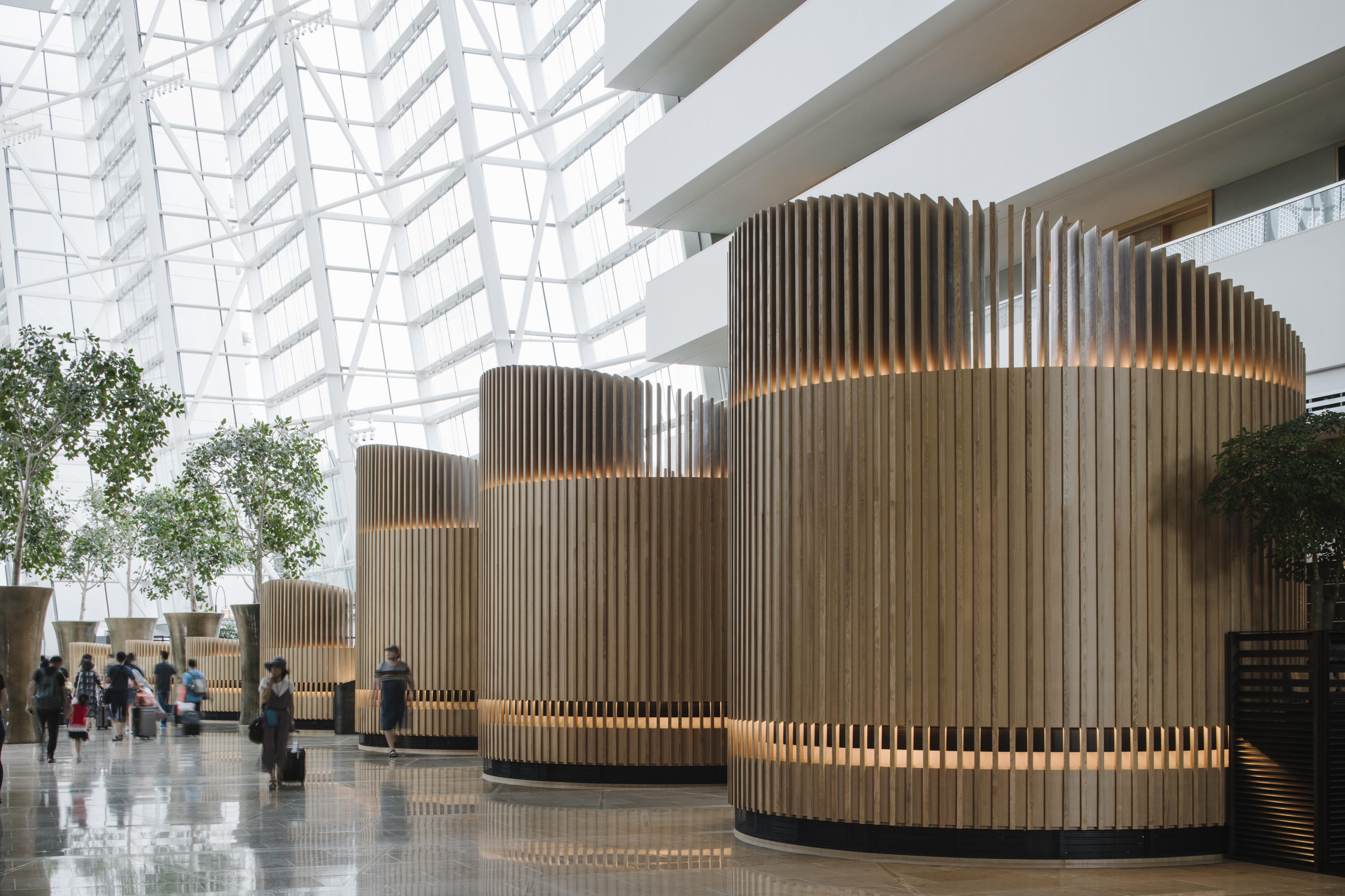
Location #3: Marina Bay Sands Hotel, Marina Bay, Singapore.


Self-reflection:
These are the images from my magazines cover, table of contents, and double page spread. LINK TO FINAL MAGAZINE Cover Page Table of Conte...
